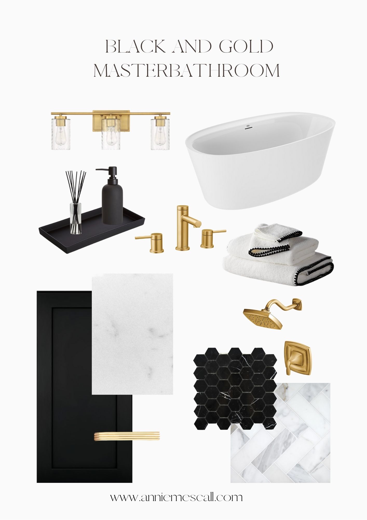
Tommy and I are so excited for our future mater bathroom. You have no idea! We are currently living with a small one sink bathroom that we share with all 3 of our children as well. That’s 5 people. The master bathroom in our new home will have 2 sinks, one shower, one tub, a laundry/storage hamper and SPACE!
For our bathroom, we wanted to do something a bit more bold and modern. So black it was! Black cabinetry is sleek and clean. I absolutely love black and gold together. Yes, it could look tacky if it’s not done right but I think when you add whites, it looks very classic. This is what we chose on at the design center for our black and gold bathroom.
WHAT WE UPGRADED
CABINETS: We did a shaker style in “Sable” (basically black). We are adding gold hardware after we close.
COUNTERTOPS: We chose to do an Omega Stone that was durable, especially with heat. The color is a very subtle marble white (similar image above). The stone is called “Fin Omega Stone-Luserno”
SINK: We upgraded our sink to have a little more depth to it. It doesn’t cost much to upgrade it
BATHTUB: A freestanding tub was a MUST for me. I just love the clean look of it and it makes for an easier clean up. I was surprised at how expensive the tubs were but it was one of those things we had to accept and pay. We had asked to put our own tub in after we closed on the house but that was a no go.
FAUCET AND SHOWER HEAD: This is where the subtle gold touches come in. We upgraded our sinks and faucet to this pretty gold one. I know it’s going to complete the entire aesthetic of our bathroom. The tub we chose is called “Amalia 67”
TILE: We did a white marble tile in a herringbone pattern
SHOWER WALL: We did the same tile as the floor for the shower walls and the tile will go all the way to the ceiling. It isn’t going to be in the herringbone pattern, it’ll be vertical.
SHOWER FLOOR: Here is our pop of black. We did a mesh black marble hexagon for our shower floor.
FRAMED MIRRORS: This is usually an upgrade but for our home, they included frames. We chose a black frame for our mirrors
WHAT WE DIDN’T UPGRADE:
DOUBLE SHOWER HEAD: This was an option we didn’t go with because we didn’t feel that our shower was long enough to comfortable fit both Tommy and I.
HARDWARE: We have no hardware in our bathrooms. We told our builders to not install any towel rods, toiler paper rods, etc.
SOFT CLOSE DRAWER: We really wanted soft closer drawers but the kitchen won that.
BATHTUB WALL: There was an option to add tile or stone on the wall that sits right next to the tub but it wasn’t worth it for us to do it.
We’re so excited for this to come together. It’s probably the most modern room in our entire home. Our bedroom will match the color tones so that our master bedroom and bathroom are unified.

